

MS Excel: Charts
In Microsoft Excel, a chart is often called a graph. It is a visual representation of data from a worksheet that can bring more understanding to the data than just looking at the numbers.
A chart is a powerful tool that allows you to visually display data in a variety of different chart formats such as Bar, Column, Pie, Line, Area, Doughnut, Scatter, Surface, or Radar charts. With Excel, it is easy to create a chart.
Here are some of the types of charts that you can create in Excel.
Bar Chart

- How to create a bar chart in Excel 2016 | 2010 | 2007
Column Chart
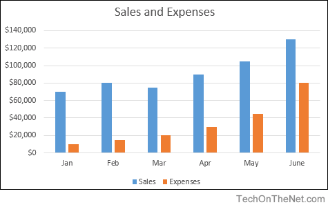
- How to create a column chart in Excel 2016 | 2010 | 2007
Pie Chart
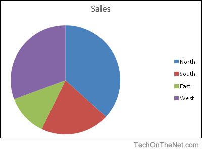
- How to create a pie chart in Excel 2016 | Excel 2007
Line Chart
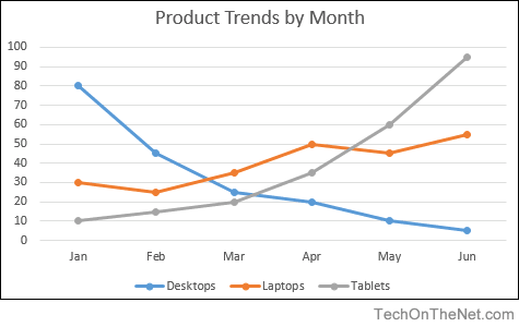
- How to create a line chart in Excel 2016 | Excel 2007
Advanced Charting
- Create a column/line chart with 8 columns and 1 line in Excel 2003
- Create a chart with two Y-axes and one shared X-axis in Excel 2007
Advertisements